Interpretation of the Meaning, Sara Choudhrey
Watch the full piece here.
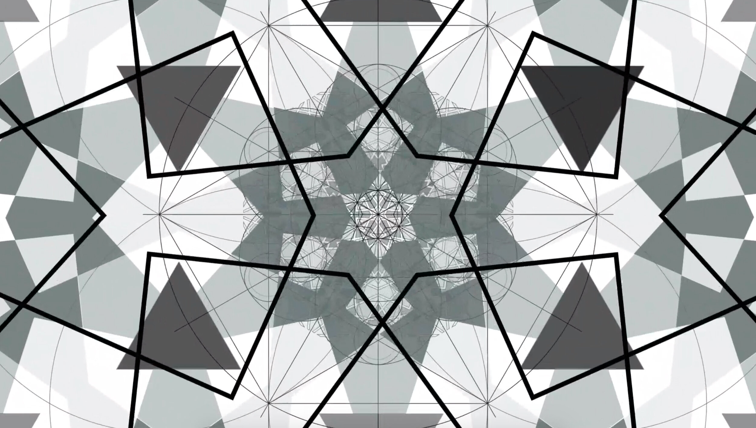
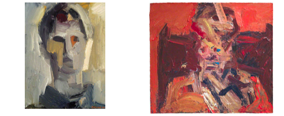
Still from Interpretation of the Meaning, Sara Choudhrey, 2020
Layering, displacement, and motion are key elements explored in Interpretation of the Meaning, an animation produced in response to the early work of David Bomberg and his contemporaries engaged with the Vorticist and Furturist movements. It is a consideration of alternative ways of looking, of materiality, technological advancement and our perceptions of time and continuity.
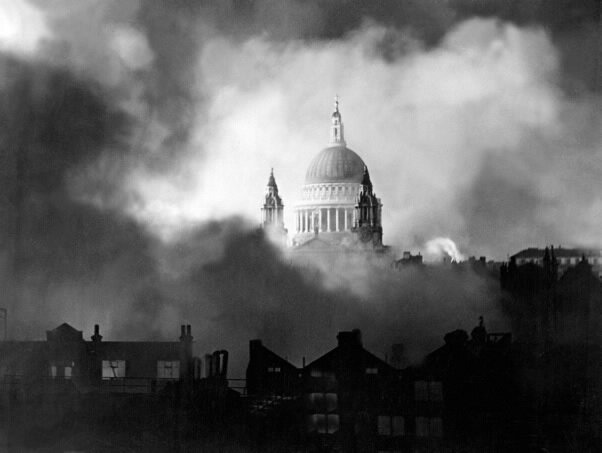
David Bomberg is often portrayed as someone who was in lifelong search, in contemplation of a truth and seeking a sense of belonging. His work produced in response to time in the Middle East, and Toledo in Spain also resonated with me. There is also his diaspora identity whilst living in London, and his having travelled to locations significant to Islamic history, including Jerusalem. Of course, the contentious situation in this region has evolved greatly, and with a change and movement of time, one wonders what the futurists may have made of the world in which their works are viewed now.
The title of the piece:
There is also a strong theme of spiritual and religious heritage in the work, and is conveyed through the title ‘Interpretation of the Meaning’, a phrase that is used for explaining and translating sacred text, often from one language to another. It implies that in the process of translating, there is a limitation in portraying the original intended meaning. Those who are multi-lingual will appreciate this, where there may not always be an equivalent phrase or word to describe the extent and essence of the original, however, in using the phrase ‘interpretation of the meaning’ there is an implied acknowledgement and value for authenticity. The play on words continues in the notion of artistic movements, movement as portrayed in the audio, in the animation format, with its own timeline and the movement of the geometric forms.
The audio:
The audio for this artwork uses the sounds of various clocks ticking in and out of sync, with additional chimes and sounds of timepieces and machinery. They are as abstracted as the sense of the space that is being explored in this virtual and unknown landscape. The viewers movement and that of the geometric shapes is an investigation of what we perceive of as our surroundings and how a space is to us as we are to it. The sound is heavily influenced by my current surroundings at home, where my father, a horologist, has set up many clocks in the midst of repairs. They have not all been set up with the same times. The correction of the time shown on the clock face is almost arbitrary. These clocks embody their own timelines, speak of having their place somewhere, belonging to someone and therefore being of material significance. They act as both props and reminders of the passing of time.
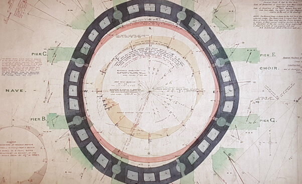
The geometry:
The animation presents what is known as an Islamic geometric pattern. It is an expanded design from an in-laid panel from the early 16th Century Al Ghuri complex in Cairo, Egypt. I chose this pattern as I found the formation of shapes and structure intriguing. It is not common to find pentagons on a 6-fold composition yet upon analysis there appear to be hidden correlations in the structure of the design that allows the 5-sided shapes to become apparent through divisions in a 6-fold layout. The geometers from this period and region would have cleverly discovered these hidden properties but did not leave many clues behind regarding their construction methods, and so there is a further connection to the idea of interpretation here. It is only through deconstructing and analysing which allows for possibilities in reconstruction of the pattern, an aspect of my practice which I wrack my brain over but also thoroughly enjoy.
My interest in the Vorticist movement:
I am in awe of artists who were inspired and exposed to cubism and the style that developed into Futurism and Vorticism. There is an abstracted conveyance of the world through this style yet it is not entirely unidentifiable through the sliced forms. The style also lends itself to an acknowledgement of the geometry present in our habitat, whether spaces of nature or those which are constantly manipulated by humankind. I feel the success of the movement centred on a strong understanding and contemplation of the way we engage with spaces through movement and also our understanding of spaces centred on a perception of light.

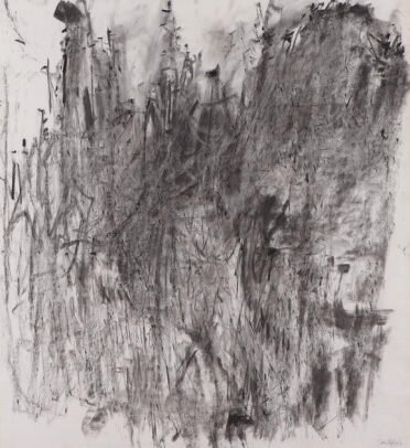
Still from Interpretation of the Meaning, Sara Choudhrey, 2020

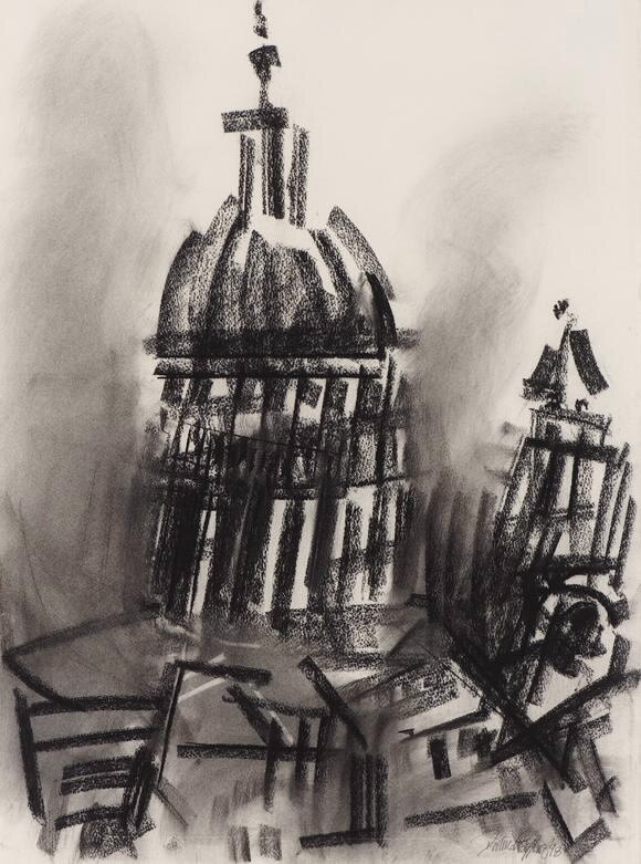
Still from Interpretation of the Meaning, Sara Choudhrey, 2020

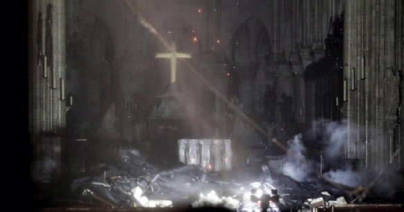
Still from Interpretation of the Meaning, Sara Choudhrey, 2020