Fraser McFarlane

Getting to Grips with Dorothy Mead’s Hands by Fraser McFarlane by Theresa Kneppers

I wanted to select this work because of its frankness and simplicity. The similarity of the composition with other popular tropes and images which use hands provided a springboard into what the painting was suggestion. Personally, I really enjoy the wet brushstrokes Mead has used, but I didn’t want any part of the content to be about artistic taste in that way. All in all, I thought that the work had great untapped potential in contemporary culture, and wanted to contribute in some small way towards shifting it into the spotlight.


The process of making the video was a tough one for someone very new to video editing. The experience I gained making a YouTube video on the Borough group was invaluable. Thankfully, although a switch of software meant more work to relearn the tools I’d be using, it resulted in less work in the long-term as the new software I used was much more responsive and powerful. I discovered how important it is at all parts of the process to label and catalogue resources and recorded elements so that you can keep track of them easily whilst juggling what you want to do. Making a video like this can be very erratic, because despite the short length of the content, it takes a long time to piece together. I think I spent over 2 hours clicking through Tracy Beaker episodes in order to find that one clip I remembered and wanted to include of Camilla Lawson. By extension, sometimes I found that my idea of a meme or joke I wanted to bring in was fabricated, or I’d misremembered it. I would finally discover a clip I thought was appropriate and find that a few words were different in the phrasing which thus rendered the reference over-worked or irrelevant.

The project has of course helped me gain an awareness of where to improve. I found that I need to take better care not to load all of the content/transitions/jokes/flashy bits towards the front of the clip. Whilst I enjoy have a moment to extend dialogue and say something a bit more sophisticated, I think both of my video are a bit front-loaded and trail slightly towards the end. Ambitions I’d had to use a greenscreen were also met with practicalities of my current budget and ability, and certainly something I’d love to work with in the future.

 Lastly, it sounds like a platitude, (and I know I would eye-roll reading this) but I also think its crucial to enjoy yourself, because approaching the task as something to have fun with really helps to stay motivated.

Dennis Creffield - Abstraction and Spectral Architecture by Theresa Kneppers

Dennis Creffield, Beauvais Cathedral (East End) - 1990

Dennis Creffield, Beauvais Cathedral (East End) - 1990

Dennis Creffield - Abstraction and Spiritual Architecture by Fraser McFarlane

The ‘David Bomberg Legacy – The Sarah Rose Collection’, held by the Borough Road Gallery, contains an assortment of works by David Bomberg (1890–1957) and his students from Borough Polytechnic (later London South Bank University). One of these students, Dennis Creffield (1931-2018), is represented by at least fifteen works, typically characterised by monochromatic charcoal markings, with seven taking cathedrals as their subject. These were part of a larger project which gripped Creffield for much of his career, might all too easily be dismissed as simply conservative in their institutionality, or uninteresting in Creffield’s persistent iteration of the theme. However, I would like to reclaim these works from those dangers, and offer interpretations which might in some small way offer a fresh perspective on these works.

The two booklets on Creffield’s cathedral series.

The two booklets on Creffield’s cathedral series.

There are taken to be twenty-six remaining examples of medieval cathedrals in England. Constructed between 1040 and 1540, the vast majority of these are built in the Gothic style, which was disseminated across the Channel in the second half of the 1100s, and emphasises height and light with arches and pinnacles. These cathedrals continued to have an enduring impact in subsequent centuries on national identity, and have often been interpreted as living historical testimonies. In 1987, Creffield was commissioned by what was then The Arts Council of Great Britain to draw these cathedrals. This two year undertaking, during which he lived in a campervan, is perhaps the most remarked upon project of Creffield’s life, and it was a foundation towards later artistic exploits, even spurring him to draw the cathedrals of Northern France in 1990. The scarce literature on the subject consists of two small catalogues, French Cathedrals (1991) for the French project and English Cathedrals (1987) for the English antecedent. The latter, published by South Bank Centre, features Creffield's own writing, which resembles both a manifesto and a journal in tone, and provides an account of his road trip in a campervan with little more than an easel and paint. Often composed in the manner of a personal saga or epic, the image conjured resembles that of other (slightly macho) creatives, such as Robert Smithson or Michael Heizer, who embark on pilgrimages to respond to environments and subjects that others might be unaware of: ‘Each day I drew them – each night I slept in their shadow – and their shapes filled my dreams.’1 These cathedrals, though man-made monuments, came, in the relative claustrophobia of England, to be seen as naturalised behemoths, or essential parts of the landscape. Creffield had said of the English Cathedral series ‘it was like wrestling with an endless succession of giants (or angels). And needing to come back each time with a hair from their head.’2 This similarity in attitude between draftsman and land artist brings forth an undercurrent of both, which is a desire to make contact with a supposed deep history, to generate ‘authentic’ experience within a context of encroaching postmodernity.

Fig 1: Dennis Creffield, French Cathedral - No Date

Fig 1: Dennis Creffield, French Cathedral - No Date

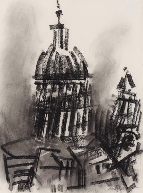
Creffield’s depictions of religious and ecclesiastic buildings housed by Borough Road Gallery (six drawings and one painting) were undoubtedly spurred on by the commission from the Arts Council, but they also differ in many respects. Whilst Creffield continued to make cathedrals his subject well after he finished his Arts Council commission, he was no longer bound to the expectation of an institution whose role it was to promote and appreciate the individual character of each cathedral, or any duty of documentation. Crucially, the lack of duty to a patron afforded a greater degree of freedom in his tendency towards abstraction. This had developed during Creffield’s time as a student of Bomberg at Borough Polytechnic, where Creffield studied modernist expression, claiming he belonged ‘to the progeny of Cezanne’. Rather than create an illusion of reality in a photo-realistic depiction, or a symbol of it by emphasising signification, Creffield tries ‘to find substantial form for [the] substantiality’ of religious buildings, a conjuring of a rawer experience of the weight and immediacy of the medieval behemoths. The impression of this ‘total response’, or what Bomberg elsewhere famously described as ‘the spirit in the mass’, can vary in the extent to which it deconstructs the subject.3 In the Borough collection, Creffield’s French Cathedral (fig. 1) is only loosely defined as a unitary entity amidst its fragmentary structure and diffusion of marks, which is perhaps the reason for its generic title. The only definitely recognisable features are the forms of the pinnacles and jutting out of the mass at the top, and a few short hard marks which distinguish their crockets. This is unlike his depiction of St Paul’s (fig. 2), in which the iconic dome is clearly depicted. Yet both these works’ monochromatic quality and use of charcoal impress upon the viewer a foreboding through their dwindling scale in relation to these structures, and the dynamism of the invisible forces which pervade these buildings and keep them upright against the odds.

Fig 2: Dennis Creffield, St Paul’s Cathedral from Clifford Chance, Aldersgate - 1998

Fig 2: Dennis Creffield, St Paul’s Cathedral from Clifford Chance, Aldersgate - 1998

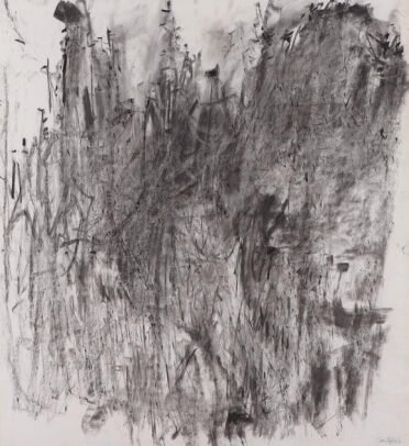
The style of the Gothic was intrinsically linked to the forest; often columns are cosmetically split and carved to look like clusters of tree trunks. Perhaps ironically, Creffield lambasted the ‘English’ tendency of planting trees around cathedrals, likening it to ‘putting a pot-plant in front of a Giotto’. Significantly however, trees offered a relatively lightweight material and were often used in the roofs of cathedrals, which was all too often hazardous to the buildings due to the risk of fires. The Gothic St Paul’s Cathedral, which was later replaced by Christopher Wren’s Baroque design, was a victim of this in 1666 during the Great Fire of London, as was Notre Dame in Paris more recently. The traces of such incidents pervade Creffield’s drawings, which seem to show the buildings as scorched, burnt out and collapsing. Bourges (West Front) (fig. 3) in particular slumps towards the bottom, where the smoky smudged quality solidifies into sketchy marks which look as if they are residual remains after a fire. I appreciate that this reading is not sanctioned by any statement of intent on the part of Creffield, but the smoldering orange which peers out from the rubble certainly makes such a reading enticing. Furthermore, such a link between the cathedrals, forests and fire is historically and artistically richer than one might initially think. The material of charcoal saw a rapid increase in use during the Middle Ages (when these structures were built), primarily for its ability to be burnt at high temperatures efficiently for forging. Creffield’s use of charcoal itself can thus be seen to presence further connotations relating to the ‘Arboreal Gothic’ and fire, contributing to the multi-layered force of the cathedrals’ petrified skeletal forms.

Fig 3: Dennis Creffield, Bourges (West Front), 1990

Fig 3: Dennis Creffield, Bourges (West Front), 1990

Fig 4: One of the first photographs taken after the 2019 fire at Notre-Dame de Paris which showed what had survived inside the building.

Fig 4: One of the first photographs taken after the 2019 fire at Notre-Dame de Paris which showed what had survived inside the building.

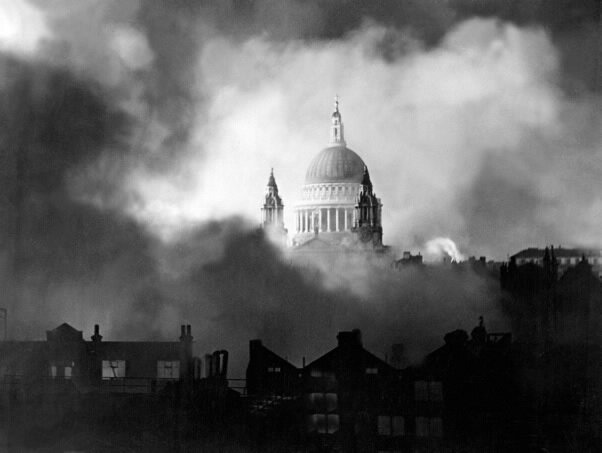
Fig 5: Photograph of St Paul’s during the Blitz.

Fig 5: Photograph of St Paul’s during the Blitz.

Advancing this post-pyrokinetic vein, Borges (West Front), has an uncanny resemblance to the widely viewed image of the altar Notre Dame after the devastating fire of April 2019 (fig. 4). The flurried cascade of marking overlap and entwine as if deconstructing, and resemble pieces of fallen burnt timber. The sense of spatial depth is also similar, with both images creating the sense of still emergent glimmer of something hitherto overwhelmed. Out of context, it would be understandable if Creffield’s drawing was taken to be a response to the image of Notre Dame, though this of course cannot be the case. As with the Notre Dame image, Borges consists of two main compositional features, signalled by a darkening of tone: the lower slumped mass which contains a warm orange flicker within it, and a levitating eminence around the center of the image. The association of these markings with spirituality is comparable with other artworks, notably Francis Bacon’s Innocent X in 1953; the works share a spectrality which dissolves the material contours of a subject but allows its presence to linger.

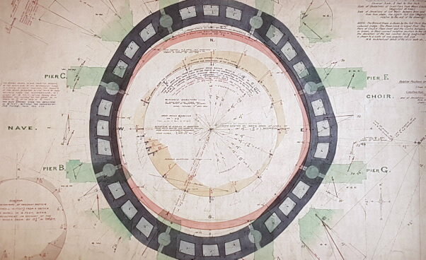
Fig 6: Plan of the base of the dome of St Paul’s showing the extent to which the rotunda had become warped.

Fig 6: Plan of the base of the dome of St Paul’s showing the extent to which the rotunda had become warped.

One may elucidate the manner in which Creffield reaches into history with his treatment of these monuments by considering his treatment of the more modern (though Baroque) St Paul’s. Whilst Creffield takes care to allow parts of the paper to peek through and preserve a trace of St Paul’s classical whiteness, much of the lower half has been smudged, evoking the tarry blackness that hundreds of years of London’s smog had left until the buildings deep clean, initiated in 1996. Notably, Creffield has the recognisable and iconic dome climb out of the darker density at the bottom of the composition, in a manner that wields similar language to the famous photograph of St Paul’s during the blitz (fig. 5). Here the leaning and buckling of the dome of St Paul’s suggests (intentionally or not) the restoration work undertaken in the 1920s. Despite many of Christropher Wren’s technical innovations, by the twentieth century, the condition of the dome was beginning to deteriorate, and the survey shown illustrates the extent to which the rotunda was coming under unequal stress from the weight above (fig. 6). The work was nationally discussed, with plenty of visual material that make the usually static dome appear like the leaning tower of Pisa (fig). In the end, the solution was to put a chain belt around the base of the central structure, effectively to ‘cinch’ everything into place. To a contemporary viewer, Creffield’s work thus destabilises and reappraises the structural integrity of St Paul’s in a way that estranges an iconic and familiar image

The works by Creffield in the Borough Road collection which take cathedrals as their subject are boldly different to the other artists and works included. These examples are fertile pastures for interpretation, and the prominence of cathedrals as a collective historical locus only encourages this. Through his use of charcoal, a product of the materials which inspired and then built these cathedrals, Creffield presences a conversation that began before any of us were born. By drawing attention to how the works contain thematic and visual suggestions of recent events and the continuing issues of preservation and conservation of these buildings, I have hoped to show how Creffield’s works continue to be provocative participants in a conversation that will continue long after we pass away. 


1 English Cathedrals (South Bank Centre: London, 1987), 6.

2 Ibid, 6.

3 Bomberg also drew Notre Dame, Chartres and other cathedrals in 1953.